Image
Various form of images which are fited into parent container on smaller sreen and add styles to them with css classes
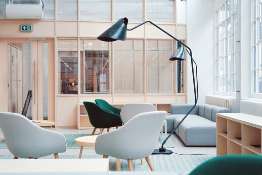
Responsive Image
Images are made responsive with .img-fluid. This class applies max-width: 100%; and height: auto; to the image so it becomes responsive.

Image thumbnails
In addition to responsive image you can use .img-thumbnail to give an border and padding. You can also add radius-* to given an rounded border.